Designing navigation for water adventure sports
PROBLEM
The water adventure sports domain is vast, broad, and deeply information-rich, making it challenging to organize content in a way that serves diverse users—from certified adventure enthusiasts to complete beginners—who have different priorities when searching for activities (some prioritize destination, others prioritize sport type).

GOALS
To design a clear, navigable information architecture for a complex, information-rich domain (water adventure sports) that would help users easily find and book appropriate courses and activities based on their preferred search approach (by destination, sport type, or skill level).
RESEARCH & MODELLING
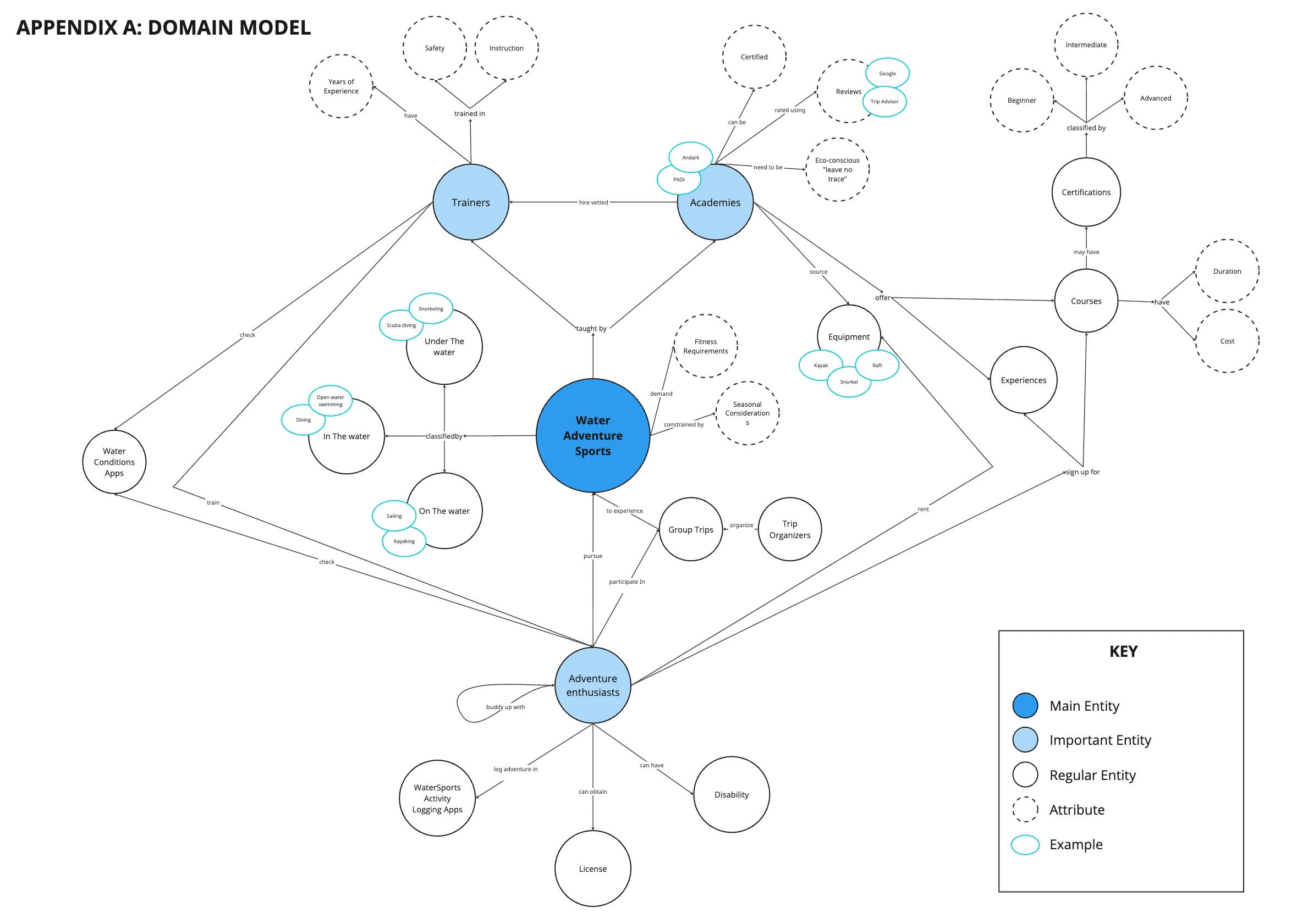
Interviewed four water sports experts (certified enthusiast, academy owner, trainer, trip organizer) to map the domain’s information landscape and identify key concepts that became initial content labels. Created a domain model highlighting entity relationships and importance hierarchies.
Domain Model
INFORMATION ARCHITECTURE
Card sorting
Open card sort with 6 participants (4 moderated, 2 unmoderated) revealed initial labels (‘experiences’, ‘courses’, ‘certifications’, ‘academies’) were confusing and overlapping. Renamed to ‘activities’ and ‘courses’ for clarity.
Closed card sort with 4 participants validated renamed labels and tested a new ‘Become a Trainer’ heading; 3 of 4 correctly placed certification labels under it.
Tree testing
Tree testing with 8 participants validated navigation paths but revealed pogo-sticking: 4 of 8 users bounced between ‘destinations’ and ‘activities’ when searching for location-specific activities. Retained headings to test search approaches of diverse users (planners/spontaneous travelers).
Sitemap
Developed final sitemap incorporating findings—a moderate flat hierarchy with refined labels and multiple navigation paths.
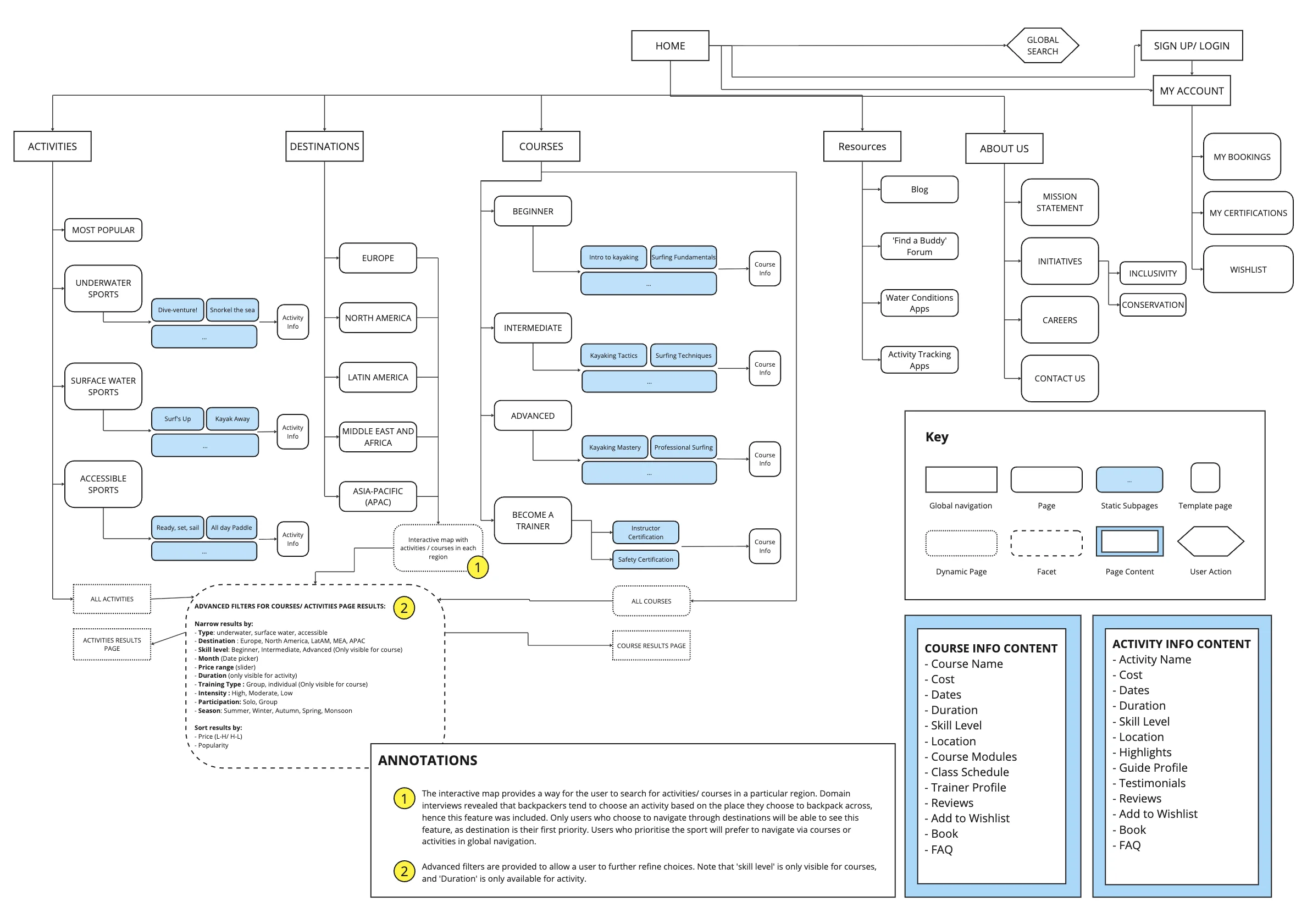
Sitemap
DESIGN
Created user journey mapping the task flow for finding courses through different entry points (browsing by destination vs. sport vs. skill level).
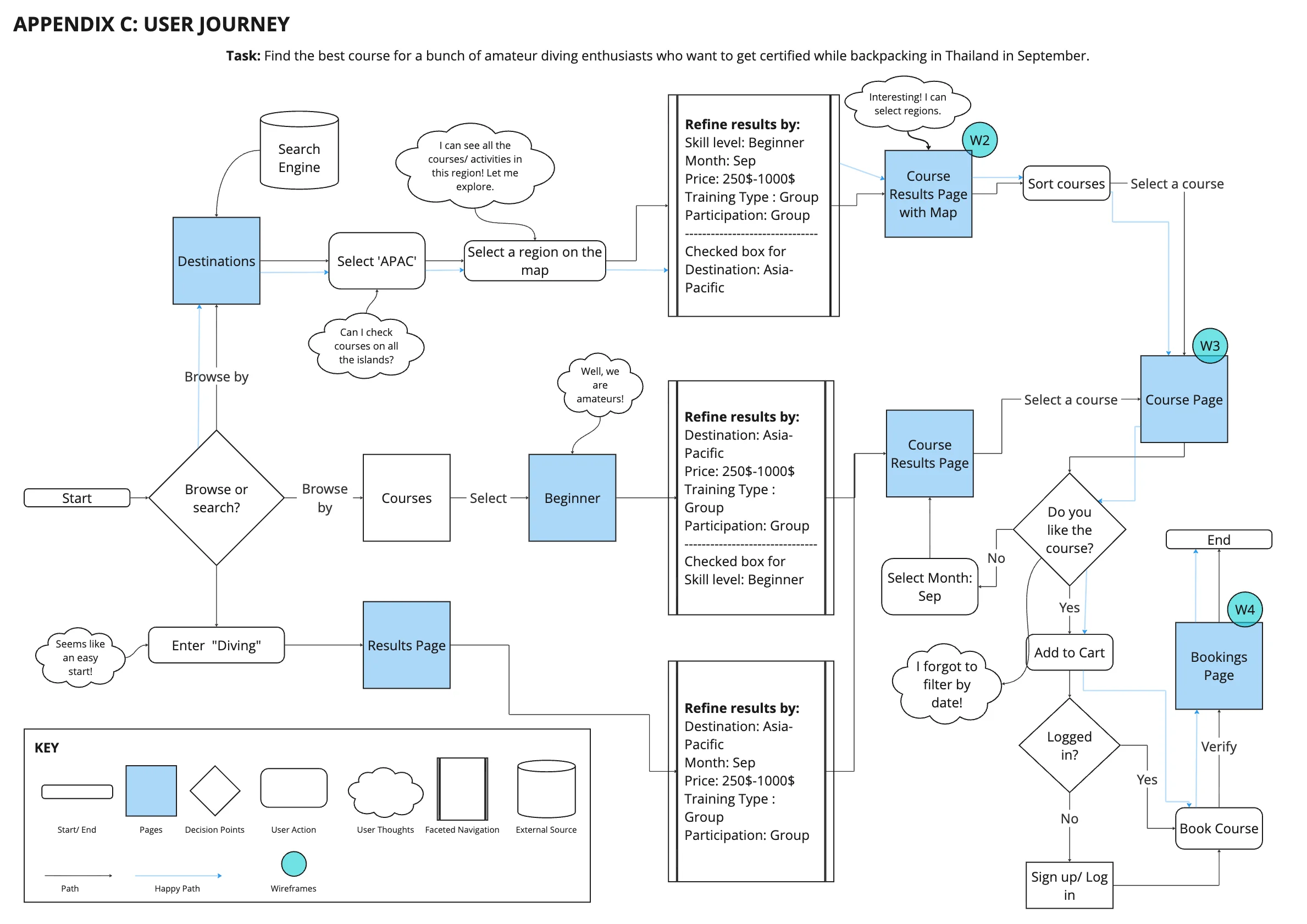
User Journey
Designed four wireframes visualizing key pages: homepage, destination/course results page with interactive map, course information page, and bookings page.
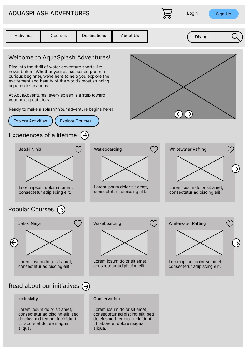
Homepage
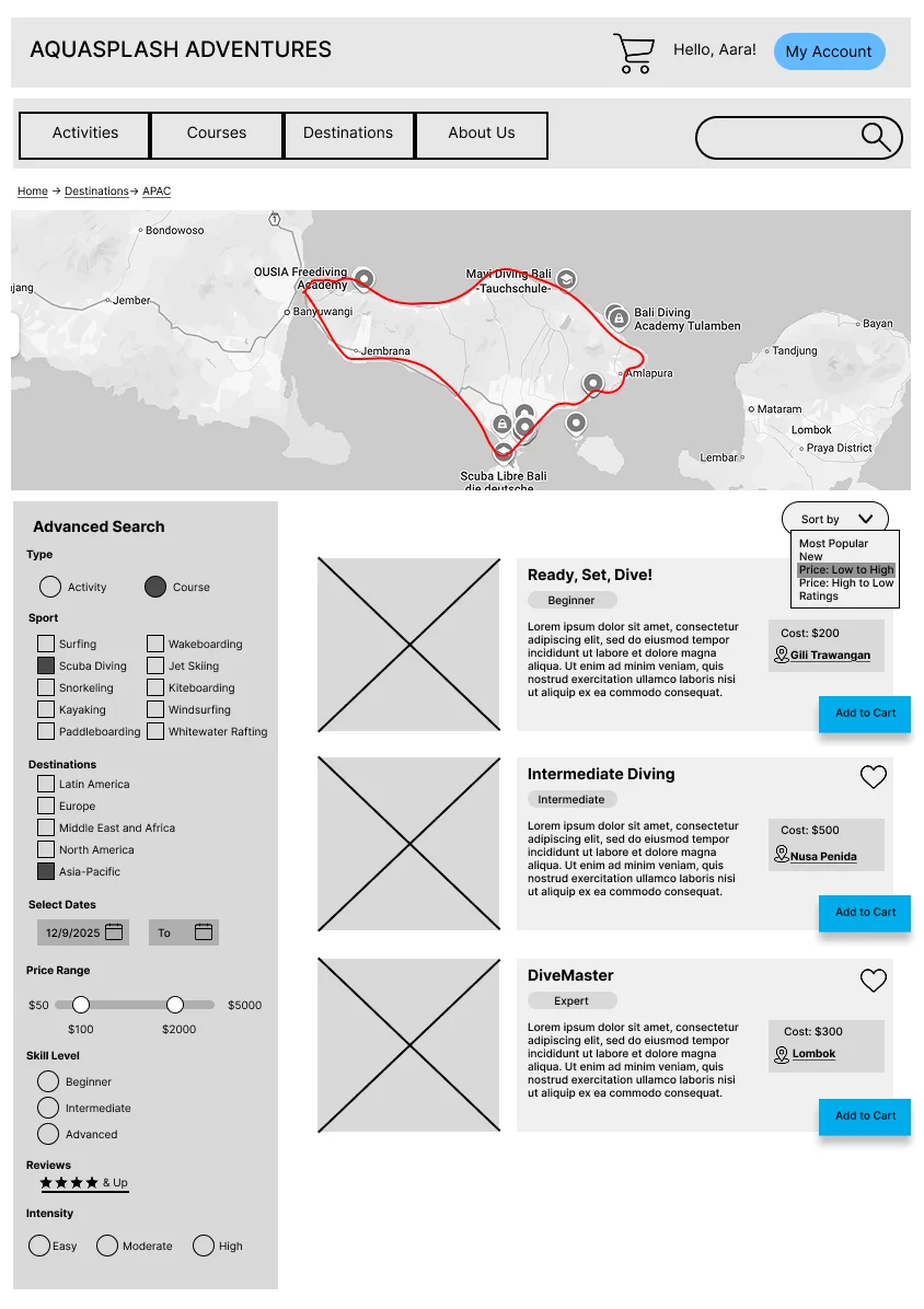
Map-first Search
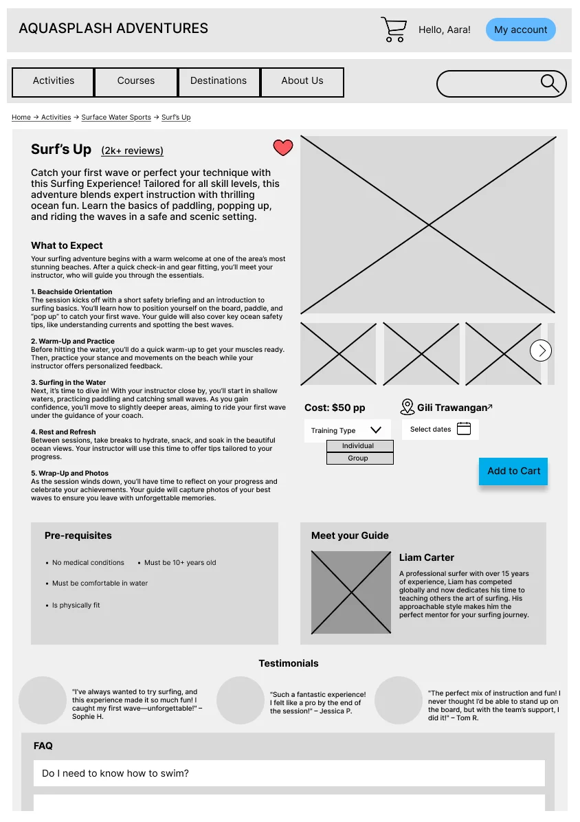
Course Details
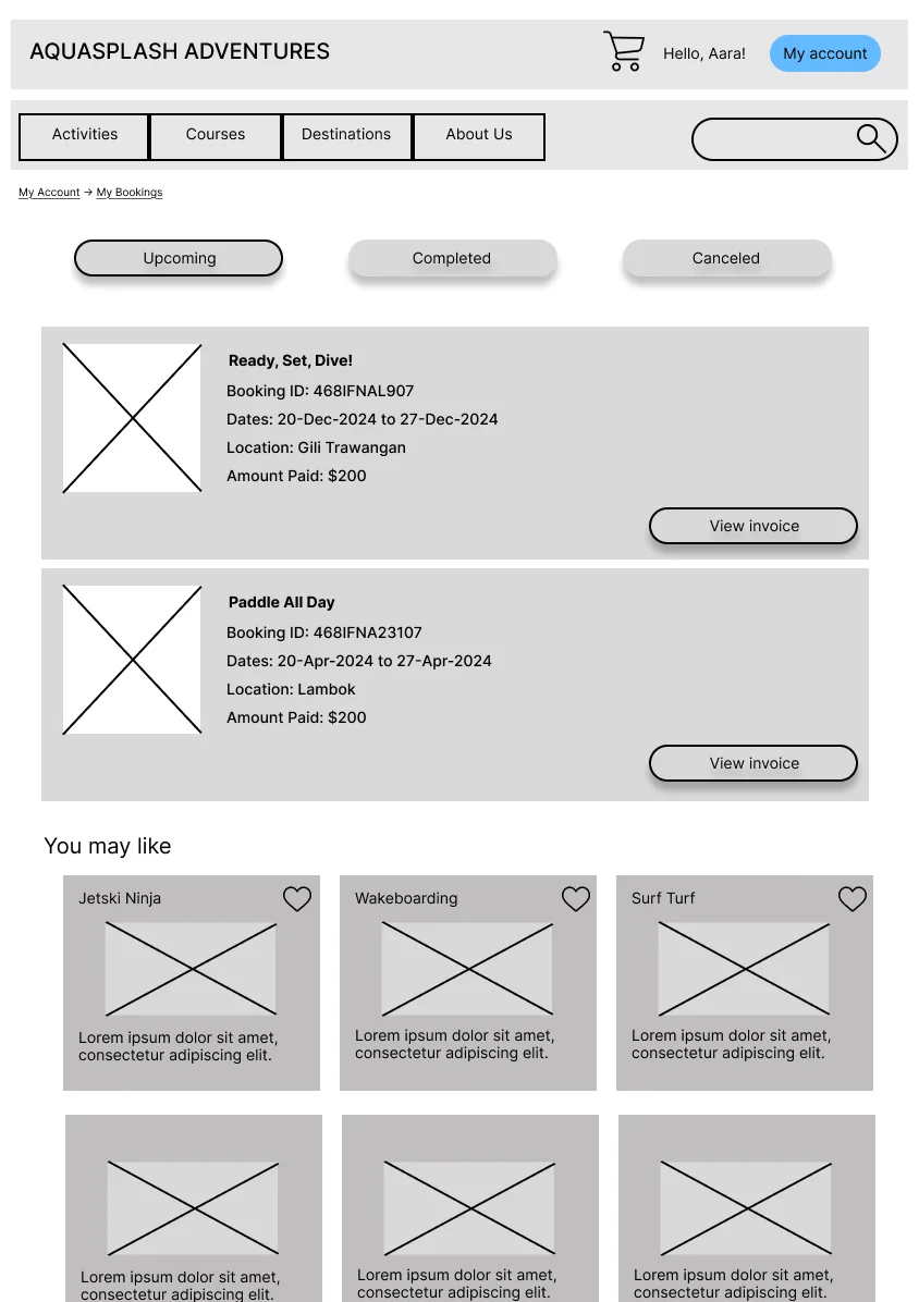
Booking Page
EVALUATION
Moderated wireframe testing with 3 participants (water sports enthusiast, backpacker, newcomer) using tasks tailored to their profiles. Tested navigation ease, element clarity, and findability through open-ended scenarios.
Destination-first navigation preference
All 3 users chose destination-first navigation over sport-first, validating its prominence despite tree test concerns:
“Well, surfing is the same everywhere, so wouldn’t you want to check out the vibes of the destination?”
Information density control
Users found text-heavy sections overwhelming and wanted control over information density.
→ Converted lengthy “What to Expect” sections into expandable dropdown menus, giving users control over information display
Map interaction clarity
Map interaction was unclear—users couldn’t distinguish between selected regions and potential routes.
→ Added “Selected region: [location]” label to map as a visual signifier clarifying interaction state
Navigation clarity
Labeling was clear and navigation intuitive overall.
REFLECTION
This project taught me that testing context matters. Even though tree testing flagged pogo-sticking as problematic, wireframe evaluation revealed users actually preferred destination-first navigation despite extra clicks. In future work, I’d prototype multiple navigation models earlier to compare efficiency against preference through A/B testing.
Most importantly, I learned that fixing every usability issue isn’t always right; sometimes user preference trumps efficiency, and recognizing when to accept that tradeoff requires contextual testing beyond checklists.